I partner with product leadership to identify the right problems before any wireframe gets drawn. My work sits at the intersection of user research, systems thinking, and business strategy.
AI doesn't replace the thinking. It frees more time for it.
Increasingly I prototype in code, not just pixels, driving Figma and Framer through Claude so a concept can become a clickable build in hours. I lean on it to synthesize research, pressure-test problem frames, and generate options to react against.
Research synthesisPrototyping in codeProblem framingCustom Claude skillsAI product design
AI I've designed
45%
of customers moved to better financial products through Jeanie, a guided conversation I shaped from a vague "build AI" mandate.
Highlight Reel
Starting Lineup · 4
01
Niche · EdTech · 2024 · Flagship
Niche Yield
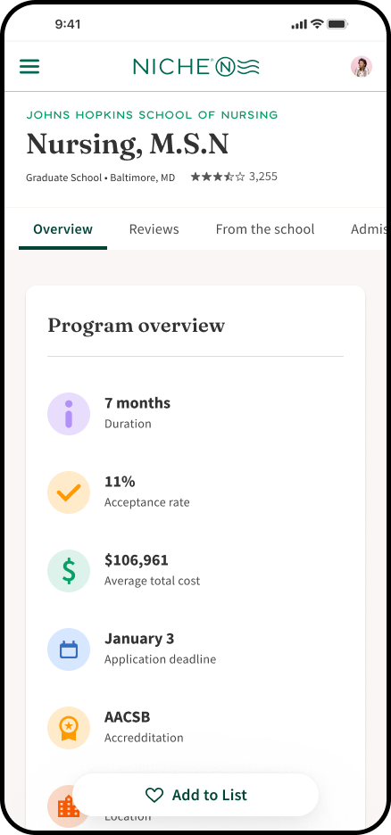
Closed the gap between students showing interest in a school and actually enrolling, while building a new commercial model. Reframed the brief before a single wireframe existed.
+17%DA enrollments
3commercial tiers
02
Niche · EdTech · 2023
Niche Inbox
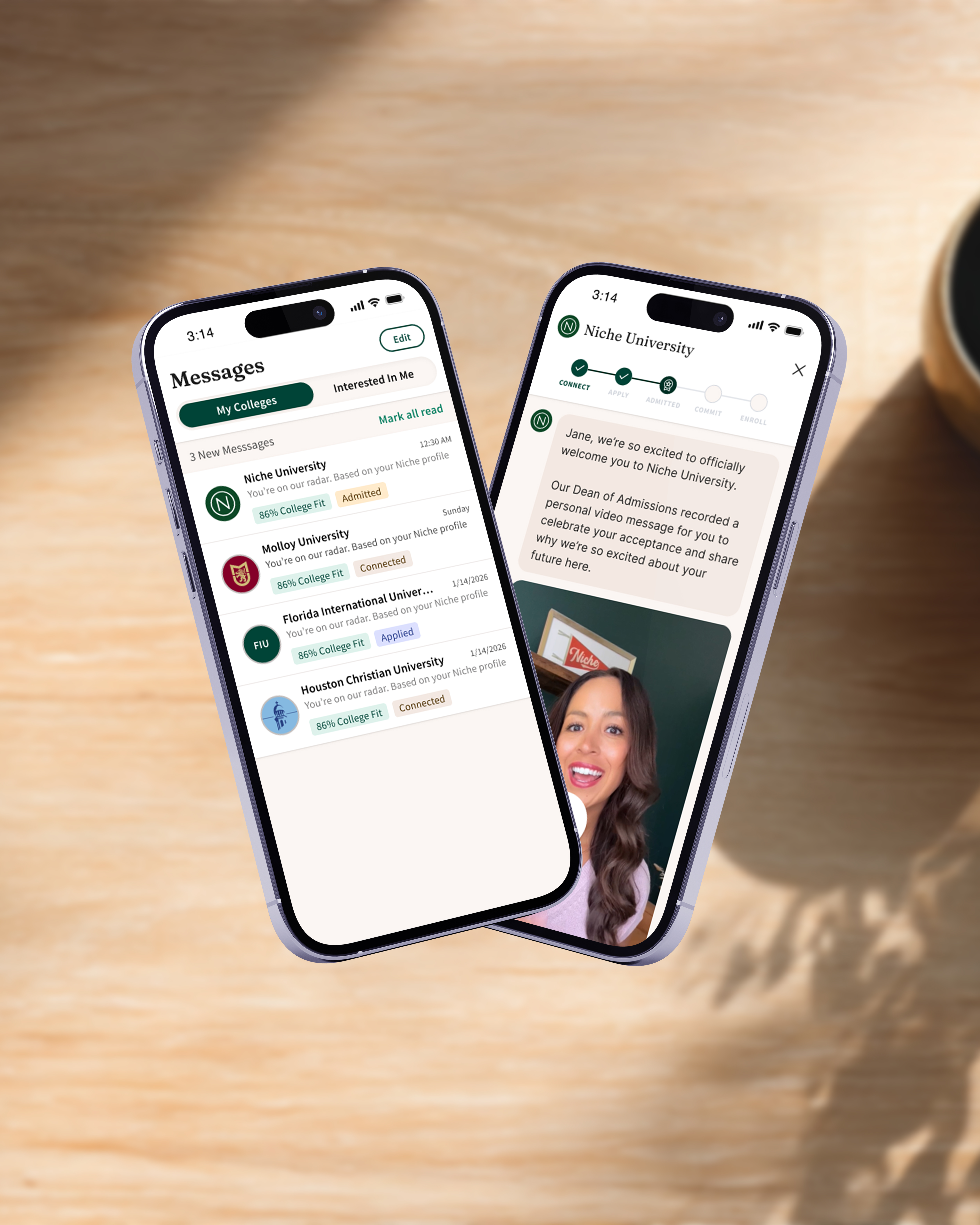
A two-tier inbox that earned 5x the open rate of email. The trust it built became the channel Yield would later convert through.
5×open rate
↓message fatigue
03
Niche · EdTech · 2023 · Research-led
Grad Searcher
The product assumed grad students chose schools by reputation. Research proved it wrong, and reshaped how the entire segment connected with students.
8→17%market share
800%+engagement
04
Fifth Third Bank · FinTech · 2021
Jeanie
Leadership said "build AI." I defined what that should actually mean: a guided conversation that led 45% of customers to better financial products.
45%better fit
↑conversion
Scouting Report
Staff · 2026
Who I am
Staff Product Designer and US Army veteran (2007–2015). Ten-plus years across education technology and financial services. I specialize in two-sided marketplace design.
How I work
I start with the problem, not the solution. Sometimes that means reframing the brief or running research that changes direction entirely before any wireframes exist.
What I care about
Products that work for both sides of a marketplace at once. Systems that hold up at scale. Research that changes decisions, not just confirms them.
Right now
At Niche, partnering with product leadership to shape strategy before any wireframe gets drawn, reframing briefs, pushing on scope, and running the research that changes direction.
Career History
Staff Product Designer
Niche
Driving the student experience strategy. Led design for the Niche Inbox MVP, defined a three-year student product vision, and evolved Direct Admissions into a more student-controlled experience.
2024 – Present
Fractional Product Leader
Audiochuck
Led design for a fast-growing podcast and media company. Directed the Platform 2.0 release with a new design system across web and app.
2023 – 2024
Staff Product Designer
Niche
Led design strategy for the client pod. Cut lead-config time 80%. Stood up a design ops practice and seeded the Direct Admissions vision.
2021 – 2023
Senior Product Designer
Fifth Third Bank
Co-led the mobile app redesign. Increased digital account opening adoption. Cut Loan Servicing complaints 20%. Explored conversational, AI-driven banking.
2020 – 2021
UX Designer
USAA Financial Services
Led design on a custom CRM for an F500 bank, a bid won against Deloitte, Pega, and Salesforce. Drove a 156% engagement lift and cut car-rental drop-offs 33%.
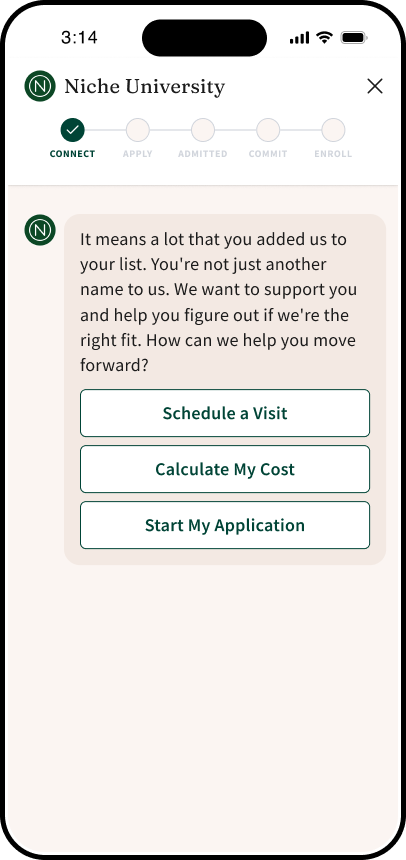
Closing the gap between a student following a school and actually enrolling, and turning a yield problem into a new commercial model in the process.
+17%
influenced enrollments (Direct Admissions)
+8%
influenced enrollments (rest)
3
commercial tiers
01 · Background
A demographic cliff, and a yield problem nobody could close.
Niche is a two-sided marketplace. Schools pay to reach prospective students. Students use Niche to discover and research colleges. The business works when those two sides connect meaningfully.
Higher ed was facing a demographic cliff. Niche was already great at the moment a student first showed interest in a school: a follow, a save, an info request. The problem was everything after. Students were signaling intent, then stalling out before applying, before responding to outreach, before accepting a Direct Admissions offer. Schools were watching qualified interest leak out of their funnels and had no way to act on it. The initial brief leaned toward a school-facing messaging tool. My first move was to reframe it.
School side
Interest leaks out
Students follow, save, request info, then go quiet. Schools see the signal arrive in their CRM, then watch it die before it becomes an application. No way to act at the right moment.
Student side
Action anxiety
Students follow 5–10 schools with no way to know what each expects next. School outreach hits as a wall of email. They can't tell what's important, optional, or missed. The default is to freeze.
The anxiety students feel is the leakage schools see. One problem, two surfaces. Nurture the student forward from interest with a clear next step, and the school's yield metric moves on its own.
02 · The real problem
Students weren't lost. They were anxious.
I ran discovery research with 10–12 schools and pulled CRM integration data showing exactly where interested students were going dark: between the follow and the application, between school outreach and a response, between a Direct Admissions offer and an accept. Affinity mapping across all three sources made the pattern obvious, students weren't dropping off because they'd lost interest. They were dropping off because the process felt opaque and overwhelming.
"The school sent me an email but I didn't know if I was supposed to do something. I just kind of waited."
Students described the window between "I like this school" and "I've taken a real next step" as a black box, no map of remaining steps, no sense of what was meaningful versus marketing, no way to tell whether silence meant "you're fine" or "you missed something." Multiply that by the 5–10 schools each student was following, and the anxiety was paralyzing.
The reframe didn't land in a single meeting. I made the case in pieces across three review sessions: the CRM data showing where interest died, then the affinity map of student anxiety quotes, then the auto-complete risk memo. By the third session, the question had changed from "how do we build the messaging tool?" to "how do we build the student journey?"
As briefed
School-initiated messaging
Schools send nudges to push students forward, with auto-complete features marking tasks "done" on the student's behalf. Risk: misrepresents progress to both sides.
As re-scoped
Student-owned journey
Show every requirement upfront. Let students own and verify their own progress. School messaging becomes a supportive layer, not the primary driver. Yield moves because the student experience finally moves.
03 · Solution
A path students could actually follow, from interest to enrolled.
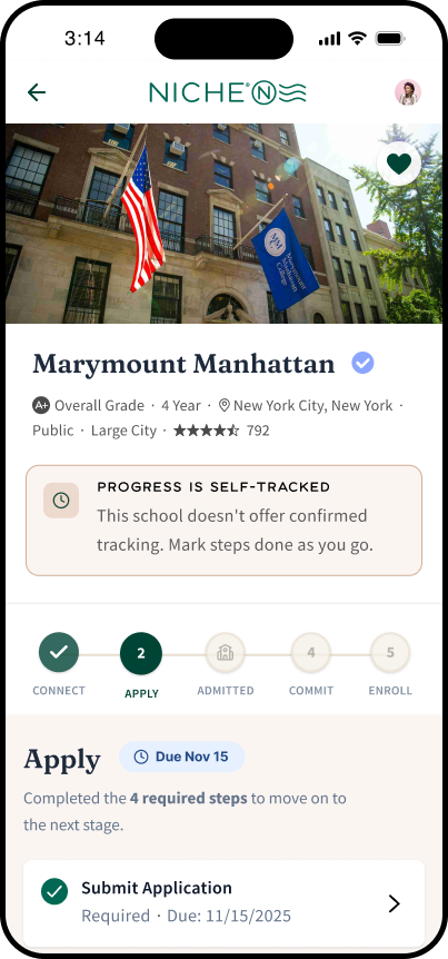
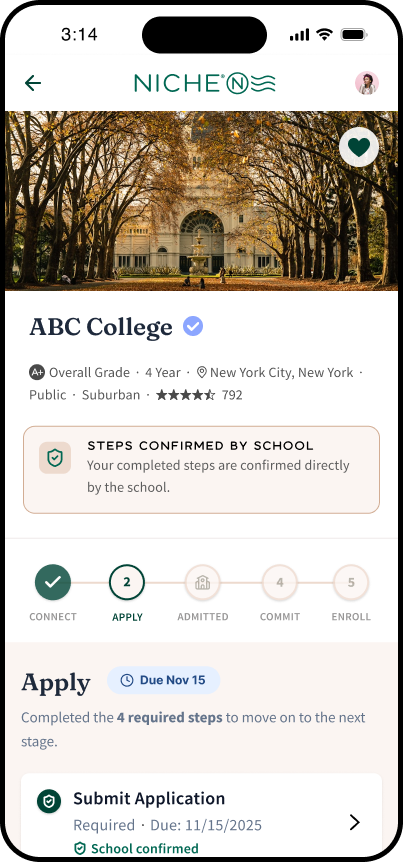
A task-based experience that meets students at the moment they show interest in a school, then walks them forward step by step. Schools define what "next" looks like for them. Niche surfaces it in a format students recognize: a clear list of meaningful next actions, the trusted Inbox channel for school messages tied to each one, and progress the student owns.
For students
A personalized list of next steps for each followed school: request info, schedule a visit, start an application, accept a Direct Admissions offer, finalize enrollment. School messages threaded to the action they're about. No more guessing what comes next.
For schools
A portal to define the enrollment journey end to end, send task-tied nudges at the moments that move the funnel, and see exactly where interested students are stalling. The first time many schools had visibility into the full window between interest and enrollment.
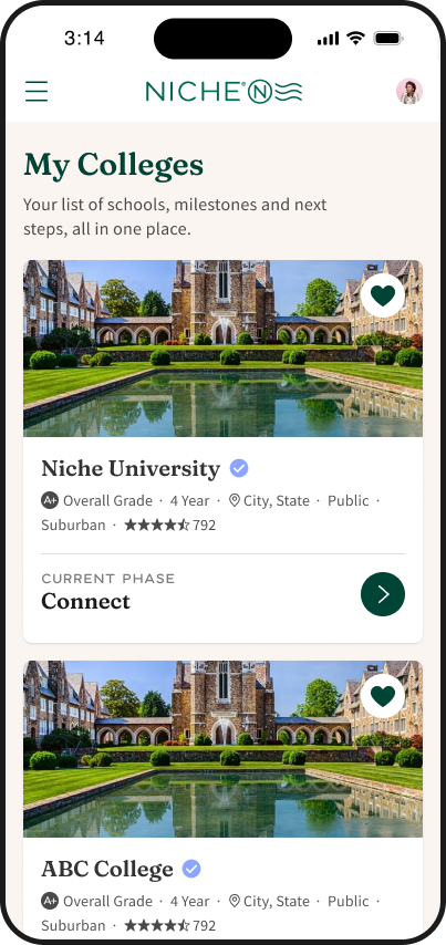
Product · Student viewYour schools. Your next steps.
School
Defines the journey
Configures the steps from "interested" to "enrolled": visit, apply, accept DA offer, deposit. Done once per cycle.
Niche
Personalizes & surfaces
For each followed school, renders the student's next meaningful action, threaded with school messages from Inbox.
Student
Sees what's next
Knows what each school expects, what counts as a meaningful next step, and what they've already done.
Product · Student viewSame interface. Two modes.
Self-tracked
School-confirmed
04 · Business model
Three tiers. A new revenue category.
The product's value to schools wasn't uniform. Some needed basic ways to reach interested students. Others needed customizable journeys and a portal to manage them. Others wanted full personalization and expanded reach. PM led the commercial structure and pricing case; my contribution was the feature mapping, translating the school-maturity patterns I'd seen in research into which capabilities sat in which tier, and where upgrade pressure would naturally land. The product became a new revenue category that didn't exist before the project started.
Tier 01
Basic Messaging
Entry point. Reach interested students in the channel they trust.
Send messages to admits
Standard engagement tracking
No CRM integration
Tier 02
Intelligent Messaging
Customizable enrollment journeys plus the portal to manage them.
Everything in Tier 01
Customizable task lists
School portal for modifications
Enhanced engagement insights
Tier 03
Full Personalization
The full stack, for schools running enrollment as an optimized funnel.
Everything in Tier 02
Custom message personalization
Expanded prospect reach
Advanced targeting
05 · Process & stakeholder management
Where the work actually was.
PM owned the commercial structure and school-side stakeholders. I owned the strategic reframe, ran the school discovery interviews, synthesized across CRM data and existing Direct Admissions student research, and designed the experience end-to-end. Our data lead built the funnel instrumentation that let us measure influence honestly: not "did Yield touch this enrollment," but "did the student act because of it."
The harder fight wasn't the reframe. Leadership was leaning hard into Inbox as Yield's primary delivery channel because schools loved Inbox. But Inbox's value to students was its signal-to-noise ratio. Pumping more partner-driven content through it was the fastest way to recreate the email problem Inbox had just solved. I argued Yield should use Inbox surgically, only for messages tied to a specific student task, and keep the rest of the experience on the Yield surface. That position took two months of repeated framing to land. The Inbox channel stayed clean.
06 · Decisions
What I killed, declined, or constrained.
Half the value of designing this product was choosing what it wouldn't do. Three calls shaped v1 more than anything we shipped.
Auto-complete enrollment tasks
AskSchool wants Niche to mark tasks "done" on the student's behalf based on CRM signals.
RiskMisrepresents progress to both sides. Student sees a task complete when the school's record may say otherwise. Trust collapses on the first mismatch.
ResolutionStudent verifies progress themselves; school sees ground truth, not assumed truth.
Killed
Sales-driven outreach to non-engaged students
AskSales wants Yield to message students who haven't shown interest yet, to widen the funnel for partners.
RiskRecreates the email-noise problem Inbox just solved. Erodes the trust that makes the channel work, for short-term partner volume.
ResolutionYield activates only on verified interest signals. Partner reach can grow elsewhere; not here.
Declined
Inbox as primary delivery channel
AskLeadership wants Yield to pump its content through Inbox, since Inbox carries the highest perceived value with school clients.
RiskInbox's student-side value is its signal-to-noise ratio. Loading Yield's full content stream in would degrade the very thing schools valued.
ResolutionInbox carries only task-tied messages; the rest of Yield lives on its own surface. Channel integrity protected; partner perception preserved.
Constrained
07 · Impact
Results.
+17%
influenced enrollments at Direct Admissions schools
+8%
influenced enrollments at the rest
35%
message open rate, well above prior comms
08 · What carries forward
The leverage past v1.
The cycle metrics matter, but the more durable outcome was what Yield seeded for the rest of the org. Two patterns from this project are now in use beyond it.
Pattern · adopted
Journey config
The school-side journey-configuration pattern Yield introduced, schools defining "what counts as a meaningful next step" once per cycle, has been picked up by other PMs as a reusable building block for school-facing tooling.
Method · adopted
Influenced enrollment
The measurement approach our data lead built, defining "influence" as the student acting after a Yield touchpoint, not just being touched, became the standard way Niche measures enrollment impact across products.
09 · Reflection
What I'd do differently.
The Inbox-channel tension was the fight I should have anticipated, not reacted to. I framed Yield's reframe well, then walked into the channel debate without a position prepared. Two months of repeated framing got it landed, but if I'd written the channel-integrity memo on day one, it would have landed in two weeks. Strategic foresight is the staff move I keep practicing.
The commercial tier structure was a late addition. Tier construction wasn't my deliverable, but PM was figuring out the structure in parallel without the school-maturity patterns from research in hand. Next time I'd hand that synthesis to PM in week two, not week ten, so the tier story emerges with the design instead of bolted on.
002 · Niche · EdTech · 2023
Niche Inbox
A two-tier inbox that earned 5× the open rate of email, and built the trusted channel Yield would later need to convert.
40%
open rate
80%
retention lift
15%
engagement on opens
01 · Background
Schools were reaching students. Students weren't hearing them.
Niche had the data showing student interest. Schools had real updates to send: direct admissions offers, application deadlines, campus visits and events. But the communication layer between them was fractured, emails going to spam, messages sent at the wrong moment, no centralized place for students to manage outreach from schools they actually cared about.
The initial brief was to improve message deliverability. I argued it was a bigger structural problem than that.
02 · The reframe
Signal vs. noise.
Students applying to college receive enormous amounts of outreach. The problem wasn't a lack of messages. It was that students couldn't distinguish the ones that mattered. We interviewed 13 students and pulled behavioral data on what they actually opened. The pattern was sharp: students glanced at messages but only clicked in when they recognized the school name. Everything else got filtered as noise, and once a channel earned that filter, it didn't get unfiltered.
Sales wanted to sell lead lists so schools could message students who hadn't engaged. I argued the moment we let in unengaged outreach, we'd recreate the email problem we were solving, and lose the open rate that made Inbox worth building.
✓ Belongs in Inbox
✓
Qualified Direct Admissions
Offers sent to students who already showed interest in a school. Clear signal.
✓
Messages from followed schools
Communications from schools the student actively tracks.
✓
Conversation replies
Responses to student-initiated interactions. Two-way engagement.
✗ Blocked from Inbox
✗
General prospective leads
Schools that purchased access but have no mutual interest. This is the noise.
✗
Mass marketing outreach
Undifferentiated blasts to large student lists. Recreates the email problem.
The nuance: prospective Direct Admissions
Offers sent to students who hadn't shown interest, but represent a real admission. Allowed in, a school pursuing you is different from a school marketing to you. That created a volume risk, which led directly to the filtering and sorting work.
03 · Solution
A middle path that didn't betray the student.
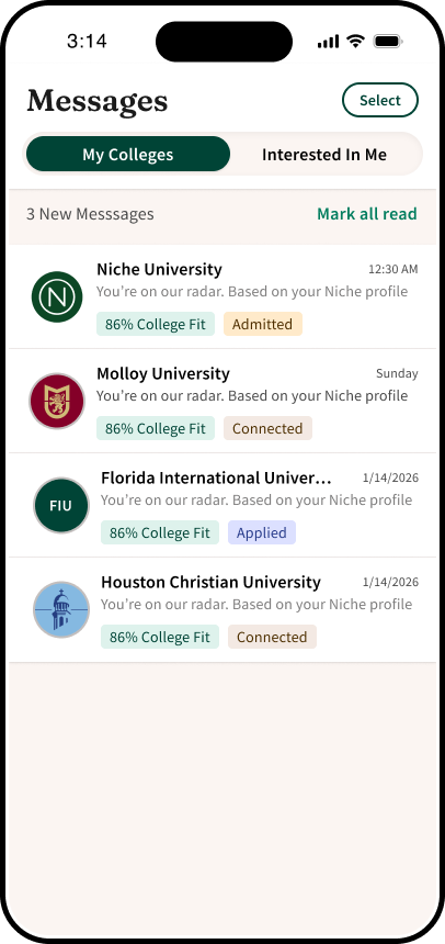
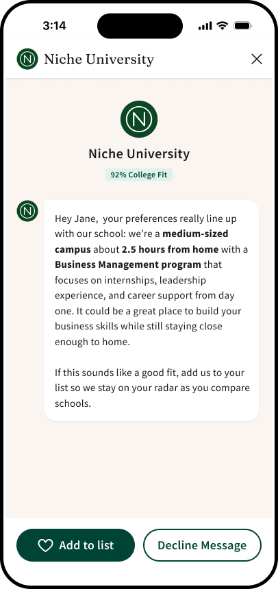
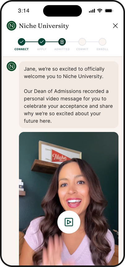
We landed on a two-tier inbox. The primary view stayed scoped to schools the student had already engaged with, protecting the signal. A secondary filter let students opt into messages from unengaged schools, on their own terms. Sales got the partner value they needed. Students kept the inbox they trusted.
Before locking the architecture, I prototyped the two-tier flow and tested it with students. The question was whether the secondary filter would feel like punishment ("schools you don't care about") or autonomy ("messages I'm choosing to see"). We iterated on the label and entry point until students described it the second way without prompting.
PM partnered on strategy and pushed the partner-value lens. I anchored every decision in the student experience. By the end, students had learned Inbox was high-signal: every message they opened reinforced the trust. That trust was the channel Yield would later need to convert.
ProductWhat we shipped.
Primary, followed schools
Secondary, opt-in
Open message
Video message
04 · Impact
Results.
40%
Inbox open rate (vs. 8% on email)
80%
retention lift after Inbox launch
15%
engagement rate on opened messages
Two-tier scoping
Primary signal, secondary opt-in.
40% open rate
5× the email baseline.
80% retention lift
Students returning for signal.
Foundation for Yield
A trusted channel for enrollment.
05 · Reflection
Pushback that ends in a third option.
Saying no to a bad proposal is easy. Saying yes to a better one is harder, and more useful. Sales had a real revenue ask. The Director of Product had a real constraint. The student need wasn't negotiable. The work wasn't designing the inbox; it was finding the third option that didn't betray any of them.
Most product disagreements aren't user-vs-business in any clean way. They're framing problems. The job is to find the design that makes both sides true.
003 · Niche · EdTech · 2022–2023
Grad Searcher
Niche's graduate search experience was built on a flawed assumption. Research proved it wrong, and reshaped how the entire segment connected with prospective students.
8→17%
market share
800%+
engagement
12
user interviews
01 · Opportunity
The graduate segment was Niche's weakest vertical.
Niche operates as a two-sided marketplace. Schools pay to connect with prospective students. For that to work, students need to engage and convert into leads schools care about.
Heading into 2023 planning, the graduate segment was our lowest-performing vertical. Traffic was thin. Engagement was thinner. Selling products to grad schools was hard because we couldn't show the audience.
To unlock business value, we needed to understand what grad searchers actually wanted from us, and how we could help them connect with schools in a way that felt useful.
02 · Discovery
Documenting what we thought we knew.
The brief was to fix the grad segment. PM's first instinct was a redesign sprint. I pushed back. The data we had, thin traffic, low time-on-page, high exit rates, told us students were leaving, not why. Redesigning against that would just give us nicer exit screens. I made the case that a short discovery sprint would tell us more than eight weeks of redesign work built on the wrong assumptions. PM agreed. We ran discovery first.
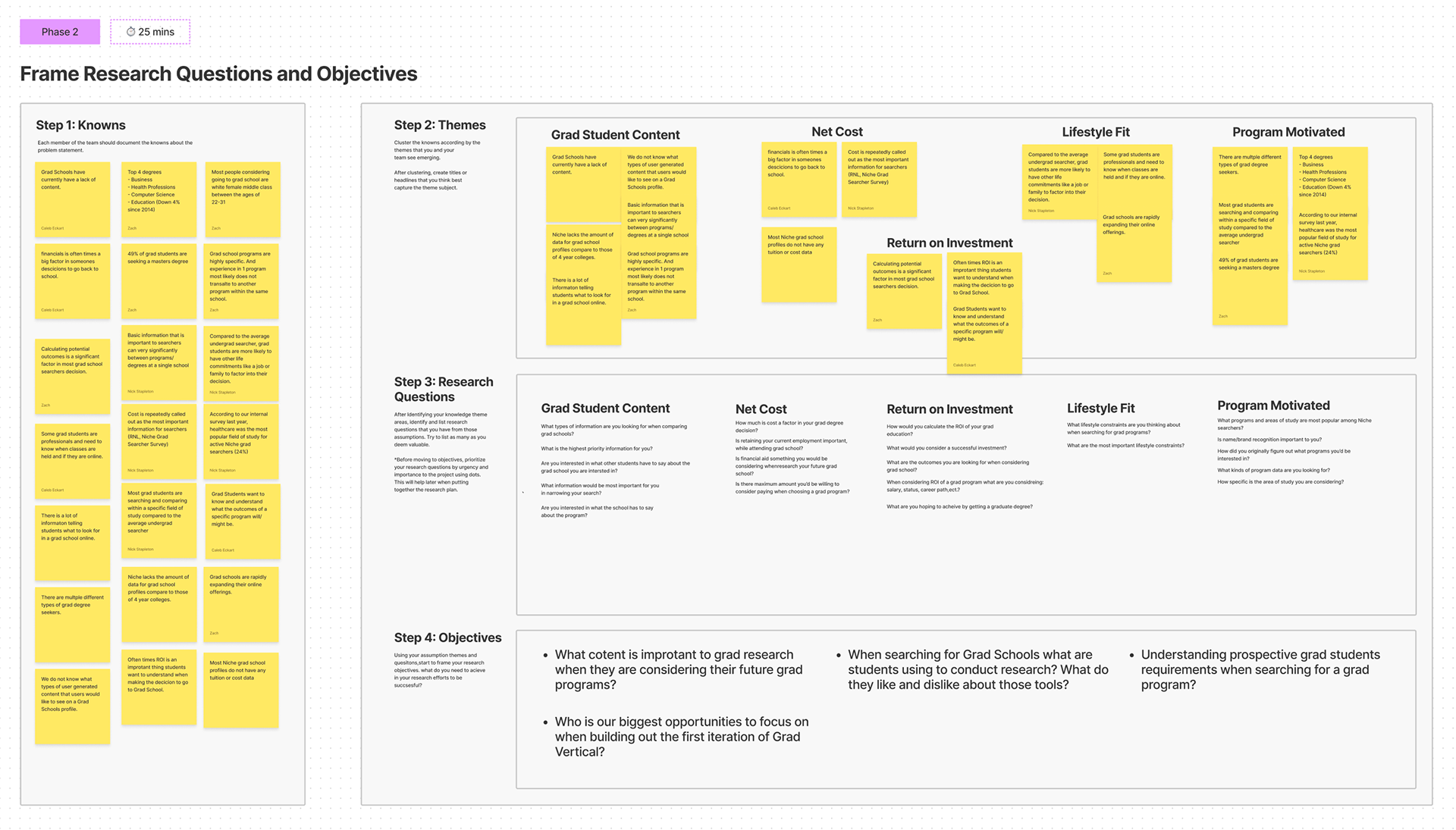
I started with secondary research, then ran a discovery workshop with PM, engineering, and data, structured around documenting what we thought we knew, what we were guessing, and where our model of the student had never been tested. From that, we wrote a problem statement to align the team:
Problem statement
"When a grad seeker researches grad schools on Niche, they often find a lack of high-level details about each school, which forces them elsewhere to find and compare programs."
Five knowledge-gap themes emerged from the workshop:
1
Program detailsWhat do students actually need to see?
2
FinancialsCost, aid, and scholarship information
3
Return on investmentWhat outcomes does a degree deliver?
4
Lifestyle fitCan students attend while working?
5
Program motivationWhy this program, not just this school?
Research artifactResearch questions & objectives · FigJam
03 · Research
The most surprising thing we learned.
I led interviews with 12 prospective grad students, people who had recently started a program, or been accepted and were waiting to begin. We dug into how they searched, what they prioritized, and what made them choose one program over another. Recent enrollees were close enough to remember what actually drove their decisions, with enough distance to articulate it. Twelve hit saturation.
Four themes came through clearly:
01
Cost was the top priority. Students needed total program cost and available scholarships before anything else.
02
Outcomes mattered more than prestige. Students wanted to know what jobs the degree led to and what salary to expect.
03
Peer experience was a strong signal. Student-to-professor ratio, faculty backgrounds, and reviews carried real weight.
04
Schedule flexibility was non-negotiable. Most searchers were evaluating whether they could attend while keeping their jobs.
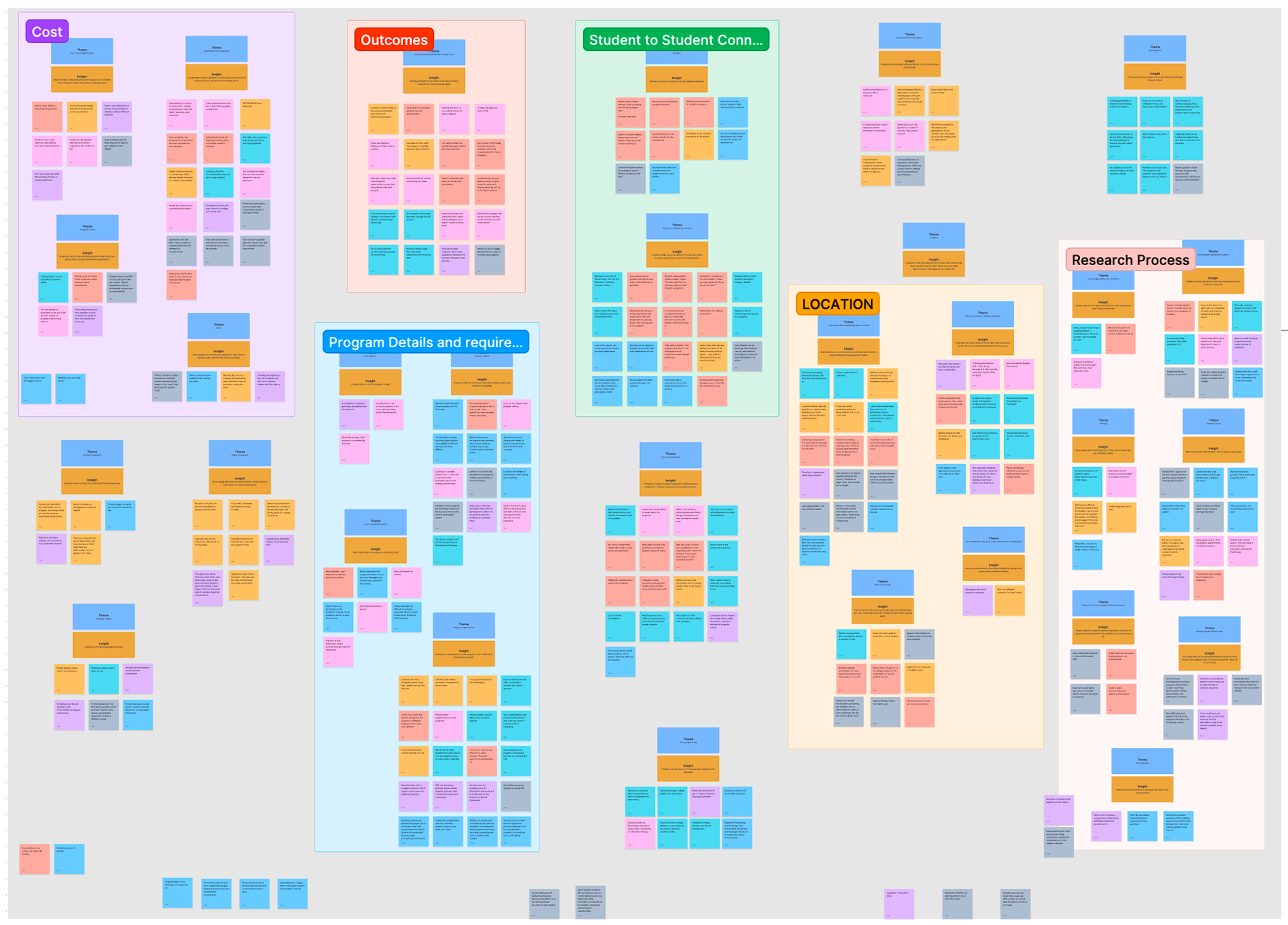
Research artifactInterview synthesis · affinity map
The most surprising finding changed how we thought about the entire segment:
What we assumed
Grad students choose schools the way undergrads do, by institutional reputation and rankings. Programs are secondary.
What was true
Grad students choose by program fit first. School reputation is a secondary filter, not the starting point.
The product had the search model backwards. We were surfacing schools when students were looking for programs.
04 · Define
Aligning on a clear direction.
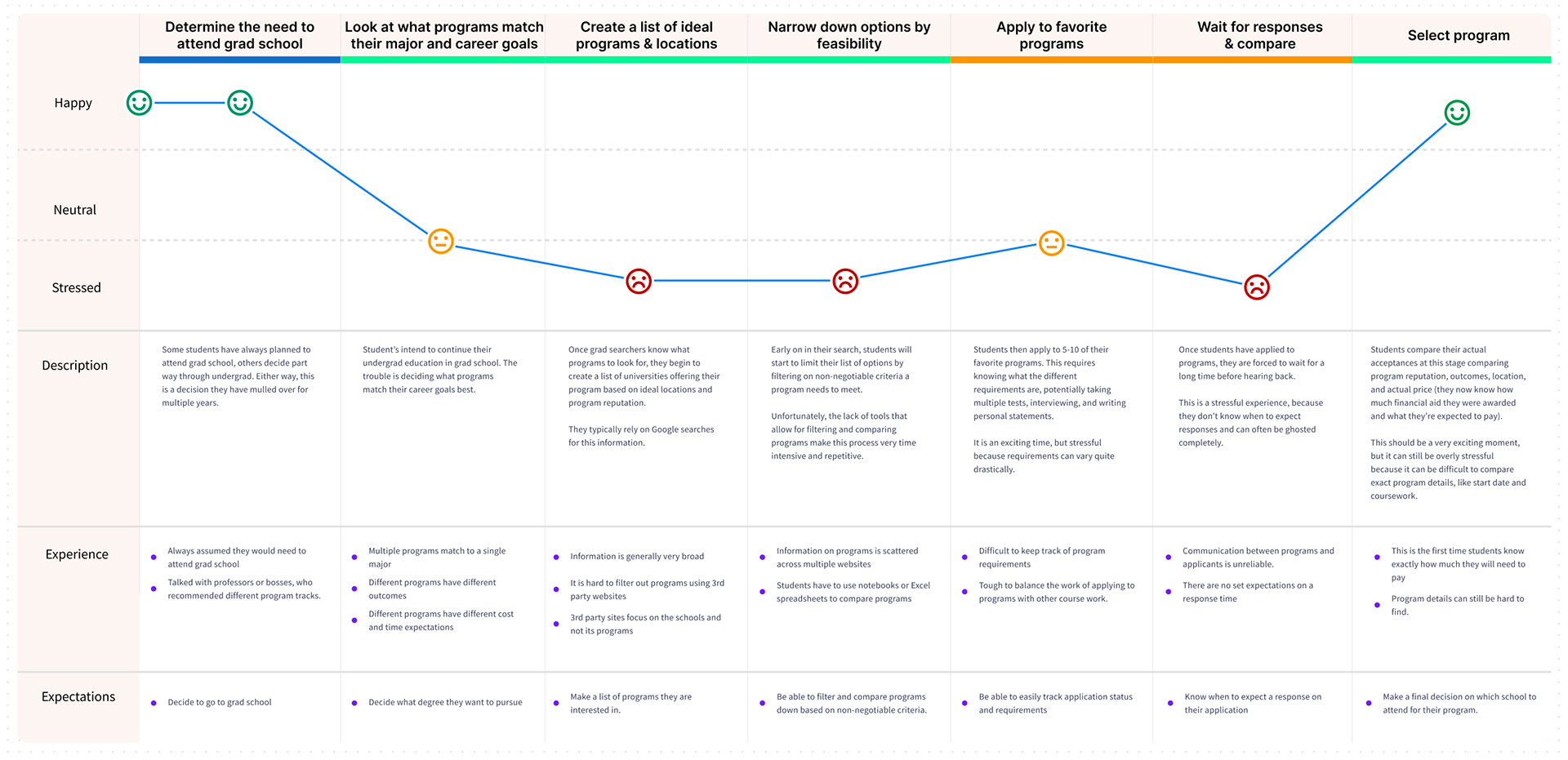
I led a user journey mapping session with the team to document where the current experience broke down, and where we had the most opportunity to close the gap between what students wanted and what we showed them. From that work, we aligned on a product vision:
Niche creates connections between grad searchers and schools at the program level, surfacing essential information on affordability, outcomes, and student experience.
Design artifactGrad searcher journey map
Success criteria we defined together:
✓
Searchers can go from search to connecting with a school without leaving Niche.
✓
Searchers can identify programs that fit their schedule and lifestyle needs.
✓
Searchers can evaluate ROI and program quality at the program level, not just the school level.
✓
Searchers can signal interest in a specific program when connecting to a school.
05 · Solution
A program-first search experience.
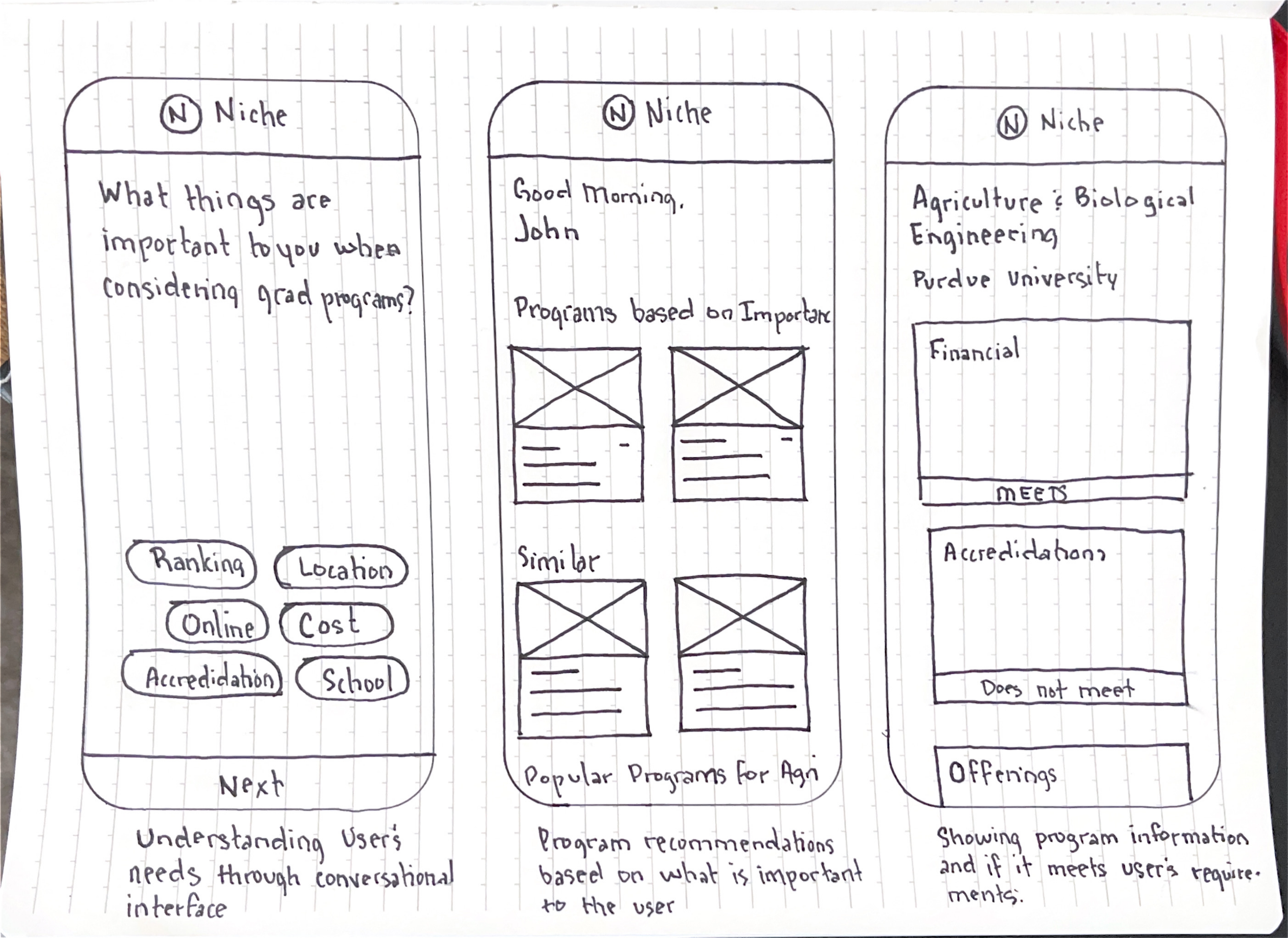
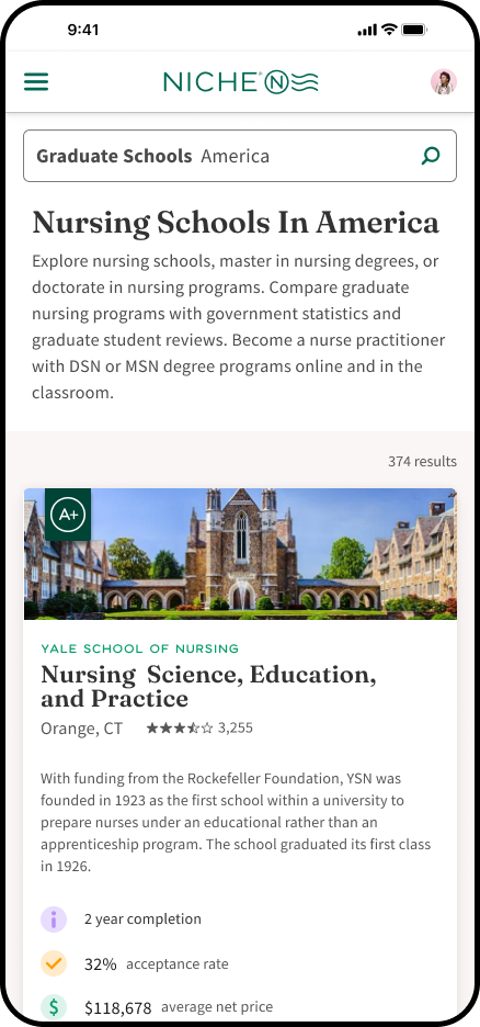
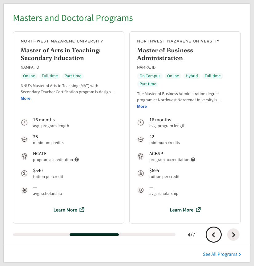
I facilitated a cross-functional ideation session. Each team member sketched how they'd solve the problem; we converged on what was technically feasible and most aligned with student needs. The direction broke from our standard product: each graduate program would have its own presence on Niche, surfacing cost, format, schedule, specialization, and student outcomes at the program level rather than the school level. This mirrored how grad students actually searched, and changed the data relationship with partner schools, who'd need to provide richer, program-level data.
Ideation artifactConcept exploration · program-first mobile
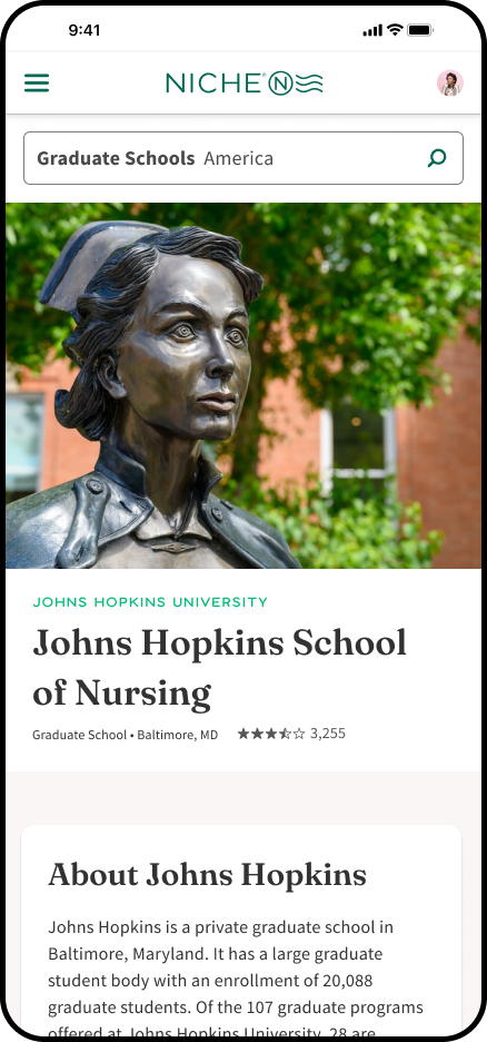
High-fidelity prototypeSearch → school → program
Usability testing surfaced two issues: students couldn't find their way back from a program page to the school's main page, and the rankings were ambiguous about whether they reflected the program or the institution. Both were copy and labeling fixes, an explicit back-to-school navigation link, and context beneath rankings clarifying they reflected the institution as a whole.
Strategic tradeoff
I designed for the full architecture: each program with its own profile page, mirroring how grad students actually searched. Leadership made the call that the infrastructure lift wasn't justified by the segment's size, after the prototype was built and tested, without team input on the tradeoff.
When the scope changed, I focused the team on what the constraint still allowed. I identified the highest-impact program fields, cost, format, schedule, accreditation, and worked with engineering to retrofit them into the existing school-page structure. The goal was to ship what students needed most, even without the architecture to support it properly. That's what launched.
Product · LiveProgram-level data on school pages
06 · Outcomes
Market share doubled.
Schools became more motivated to update their program information through the partner portal once they saw what richer data was unlocking. The leading indicator was student engagement: search interactions on grad content jumped 800%+ in Q3 2022. The trailing outcome was business: graduate market share moved from 8% to 17%.
Student value
800%+
increase in grad search interactions, Q3 2022
Partner value
↑
schools reported stronger traction through the partner portal
Business outcome
8→17%
graduate segment market share, post-launch
07 · Reflection
The work was correct but bounded.
We doubled market share with what we shipped. The full vision, individual program profile pages, never made it. Leadership pulled the plug on continued investment shortly after launch, and resources transitioned back to undergrad.
What I'd do differently: invest earlier in the strategic case, not just the design work. By the time the architecture call landed, leadership was weighing infrastructure lift against an unknown ceiling for the segment. A clearer written picture of what grad could be, sized, modeled, presented to the room, might have changed the conversation. That was the lever I didn't pull, and the one I'd reach for first next time.
What stays with me is the methodology. Leading with research before solutioning is what made the work land. The data did the convincing on every cross-functional decision that mattered.
004 · Fifth Third Bank · FinTech · 2021
Jeanie
Leadership handed me an open AI brief with no problem statement. I reframed it, defined the scope, led the team through a design system for conversation, and shipped a product that led 45% of users to better-fit financial products.
45%
better product fit
↑
conversion
↓
fees
01 · Background
The directive was "build AI." The problem hadn't been defined.
Fifth Third Bank wanted to build something with AI. That was the extent of the brief. No customer problem. No success metric. No scope. Just executive signal that this was the direction.
At a staff level, an underspecified brief isn't a gap to fill. It's the actual job. I was positioned for it through my work on the online account opening team, where I'd already seen the downstream cost of customers choosing the wrong products. That context gave me a starting hypothesis worth testing.
02 · Framing the problem
Reframe it, or build the wrong thing.
Data showed most customers weren't in products suited to their financial situation. The bank saw lower engagement and higher churn. Customers paid avoidable fees and didn't understand why. Neither side was winning. The easy path was to build what was asked for: an AI demo. I pushed for a different frame.
I aligned leadership around the emotional framing: this wasn't a cross-sell problem, it was a trust problem. Customers who feel confident in their financial choices stay. That reframe changed what leadership was willing to invest in, and set guardrails against building something manipulative.
03 · How I shaped the direction
Research first. Direction second.
Before any design work started, I ran stakeholder interviews to understand what leadership actually needed versus what they'd asked for, eleven stakeholders across digital, product, and consumer banking. One theme dominated: the bank wanted to be a relationship bank, not just a transactional one. That was the insight that unlocked the product direction.
On the customer side, we ran a user interview and co-creation session with 12 participants representing Fifth Third's five core personas. What we heard was consistent: customers wanted financial advice that was tailored, proactive, and available when they needed it, not buried in an FAQ or routed to a call center.
Business goal and customer need aligned better than expected. Reducing dependency on human customer-care agents would only work if the AI was actually useful. That connection became the brief I took back to leadership.
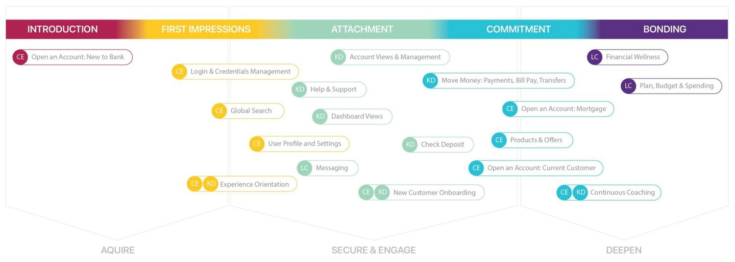
Strategic artifact · Relationship architectureFeatures mapped to relationship phases
04 · Key decisions
Three decisions that defined the product.
Guided conversation, not open chat
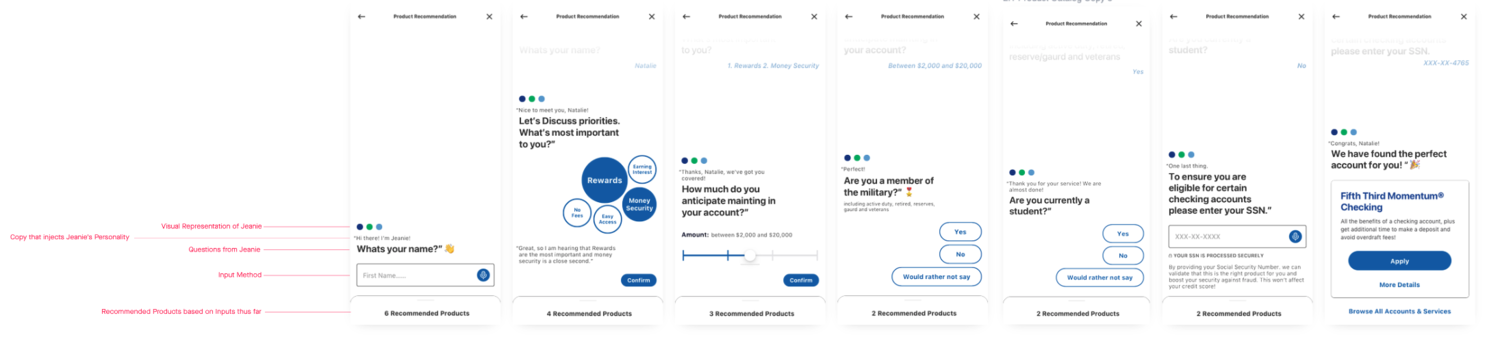
We had a specific first goal: understand the customer well enough to recommend the right product. An unconstrained AI could go anywhere, not useful yet. I defined the questions Jeanie needed to ask and the logic mapping answers to recommendations.
NLU, not a rule-based bot
A scripted decision tree would have felt transactional, the opposite of relationship banking. Natural language understanding let customers talk the way they actually think about money. The tradeoff: more ML complexity, a meaningfully better experience.
What we explicitly didn't build
No open-ended chat. No general-purpose assistant. Scope creep in conversational AI creates bad experiences fast. I held that line through build, even when the ask drifted back toward "make it feel more like open AI."
The framing constraint
Product fit, not product push. Every decision had to pass one question: does this help the customer understand their situation, or just move them toward a product? That guardrail shaped tone, interaction patterns, and what Jeanie was allowed to say.
Usability testing with 21 participants, spanning all five personas, validated the NLU decision directly. Participants who hit menu-driven selection perceived Jeanie as less intelligent. When the same flows used natural language, they rated the AI as smarter and more trustworthy. The call we'd made months earlier had measurable perception behind it.
Product · Guided recommendation flowNarrowing from 6 products to the right one
05 · Leading the team
Conversational design doesn't come with a rulebook.
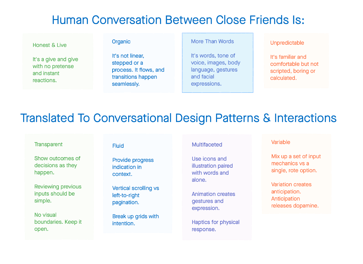
Before any screens existed, I ran a two-hour design exploration with the team. The prompt wasn't "design a chatbot." It was: how would a trusted friend with financial expertise ask about your money? I used out-of-industry references to break fixedness around how a traditional bank presents itself.
That session produced the conversational design principles Jeanie was built on, turn-taking, compliment patterns, tone calibration, how to handle failure states without breaking trust. It also gave the team shared vocabulary, which mattered when we hit disagreements during build.
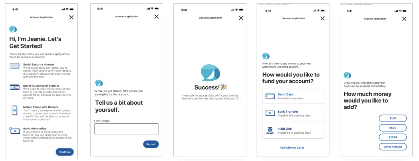
We stress-tested component patterns with the full design team before any user testing. That internal pressure revealed a critical gap: when a user made a selection, there was no satisfying confirmation state that didn't default to a "submit" button, which broke the conversational feel entirely. Catching it inside the team saved a usability round.
Product · Account opening flowFrom first hello to funded account
06 · Impact
Results.
45%
customers chose better-fit products
21
participants in moderated usability study, all active digital banking customers
Usability confirmed what the product had assumed: when Jeanie could resolve the issue directly, participants preferred her over a wait queue for a human agent. Cross-functional alignment with compliance and legal held the product in scope and kept the trust framing intact through launch. Fees from mismatched products and conversion trended positively for customers who completed the guided flow, though those metrics weren't formally instrumented at this stage.
07 · Reflection
Holding the brief is part of the job.
The harder challenge wasn't the design work, it was keeping the product pointed at the right problem long enough to ship it. There were multiple moments where the ask drifted back toward "make it more like open AI." Each time, I had to reorient the conversation toward what we'd actually set out to solve, and why that was still right.
The conversational design principles and component patterns we documented didn't disappear when Jeanie shipped. They became a reference for how Fifth Third approached messaging design after. That's usually when you know the framing held, when it keeps running without you.
This was also the first time I worked closely with an NLU backend. The gap between what a model can do and what a product should do is a design decision, not an engineering one.